My Works
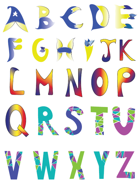
Work #1 - Alphabets
I needed to create my own letters using Adobe Illustrator and one of the other requirement
was
to use three different colour schemes. I went for the complementary, triadic and analogous
because I wanted to
create a colourful palette hence I used little repeated colours. For the first
set, I decided to make the
layout
of the letters simple and made it similar to how flower petals
are formed, hence the reason why the edge of
the
letters resemble the shape of flower petals.
For the second set, I did not change the shape of the letters
much
because I felt that the colour
scheme used for this set would fit in with the normal shapes of letters. For
the
last set, I used triangle
for sections of each letters because I wanted to create mosiac shaped letters and
also
to create that
cracked effect. I also played around with the colours I chose for this colour scheme so that
the
colours
would not look repetitive and boring.
Work #2 - SleepWell
My team and I came up with a brand name, “Sleepin’ Beauties”. We did not use the word
“Sleeping” and used “Sleepin’” instead as it sounds more cool and interesting. The story behind that is that we
used
the Disney movie “Sleeping Beauty” as a reference hence how we came up with the name. We also created a tagline,
“We
sleep, We pass (away)”. After we decided the tagline and name, we then moved on to deciding the colour scheme. The
colour scheme that we decided on is monochromatic. The typography we all agreed on is the Display typography hence
the reason why we are using Display fonts.
The target audience would most likely be people who are interested in buying beds, as beds would be the most
relatable thing to the word “Sleepin’”.
The base colour that I used is yellow and the reason why is because I feel that yellow gives us a feeling of
warmth.
When we are sleeping, we usually sleep in comfort and the bed gives us warmth hence the reason why I used
monochromatic colours of yellow. I included stars in the design because I felt that if I were to just draw the
moon
and the person with the name and tagline, it would not look as interesting. Another reason is also because there
are
shooting stars in the night sky. Thus, it represents the shooting stars in the night sky.
The person is essential as there must be someone sleeping on the moon, if not the brand name would not make sense.
I
added a message above the person to indicate that the person is dreaming and is sleeping.
Initially, I wanted to make the moon very plain and did not add in the lines that breaks the moon in pieces as
shown
in the design above. However, I felt that it was quite plain without the final design hence the reason why I chose
to break the moon in pieces as it looks more interesting that way.
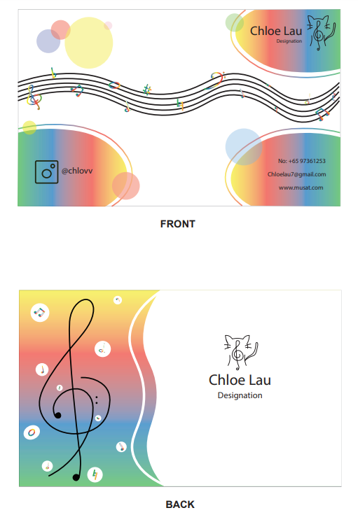
Work #3 - Namecard
I needed to create a namecard that represents myself. I decided to go with a rainbow colour
scheme because I wanted to make the namecard look simple and vibrant. Since the background colour of my namecard
was white, using primary colours would go well as it would stand out against white which is why I went for the
rainbow colour scheme. My theme was music, therefore there are many music notes and also treble and base clefs. I
added in the logo that I first designed and also put in my details as it was one of the requirements.
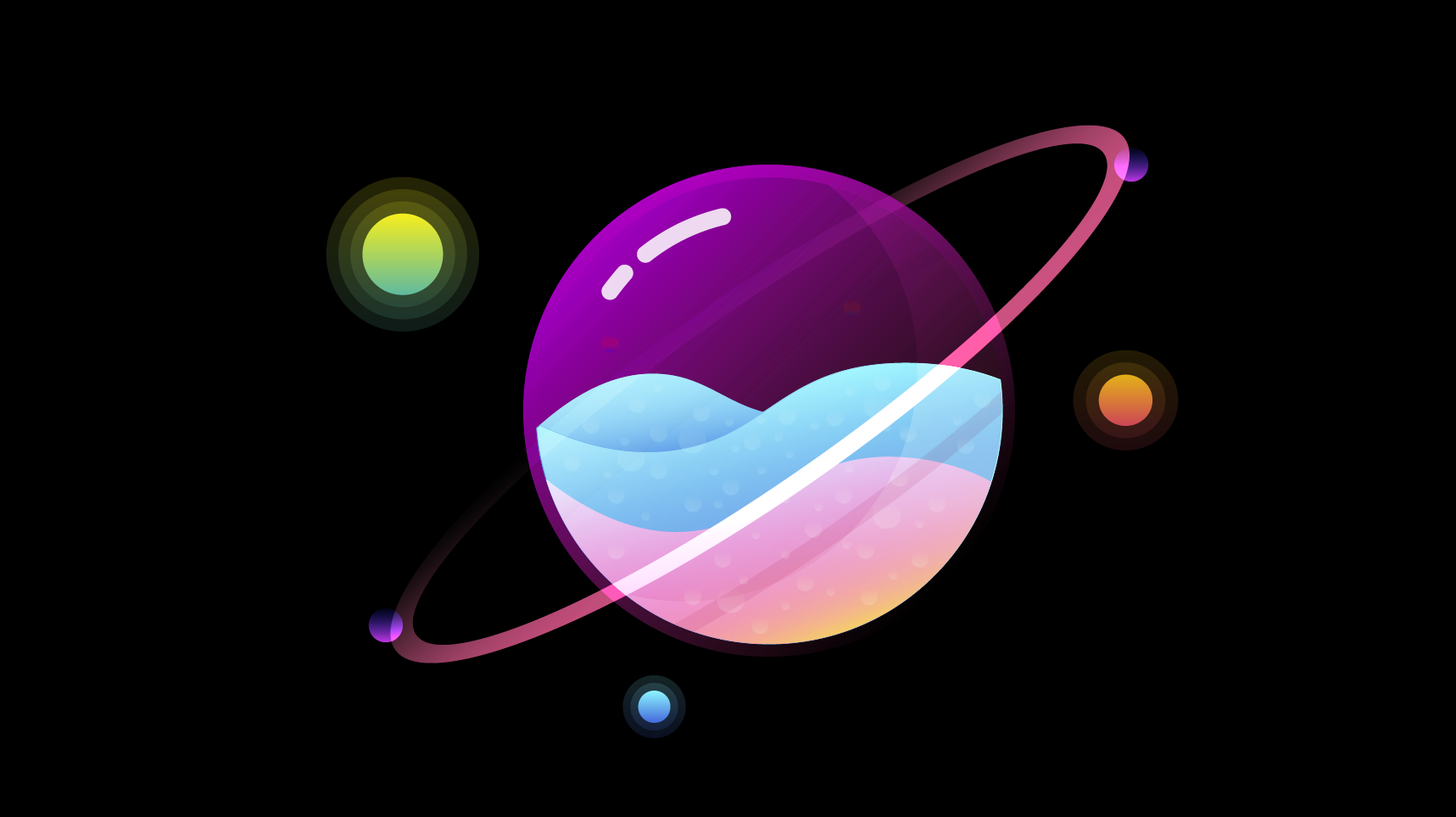
Work #4 - Planets
This is a graphic design that I created while following tutorials from youtube. I used bright colours for the planets because it constrasts with the black background. It also helps make the planets stand out because light colour is used against dark colour. I played around with the transparency because I wanted to make the planet look like a glass ball with water inside and then used white colour on the outer ball to make it look as if the glass ball is shining. I mainly used primary colours (Red, Blue, Green, Yellow) as I wanted the planets to look vibrant and colourful.
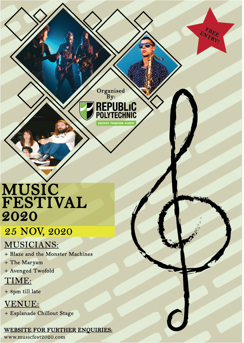
Work #5 - Poster
I used tones of yellow and Adobe Photoshop for this poster as I wanted the text to be the focus. Initially, I wanted to use squares instead of diamonds to show the picture but I felt that squares would look too common and plain. Hence, I decided to use diamonds and also played around with the positions and sizes of it so as to make the poster look more interesting and engaging. I also did a pattern in the background using shades of yellow. Since the theme is music, there is a treble clef at the side to indicate that it is a music event as treble clefs are related to music. I did not put in many diamonds because if I put too much, it would look very cramped hence I just put enough to fit in the right left hand corner of the poster. I also used black for the text because I wanted the text to be the focus of the poster. The poster is used to advertise the event, therefore the people who are interested in this event must be able to read the text clearly. Using black on light yellow makes the black stand out because a dark colour is used against a light colour therefore there is contrast.
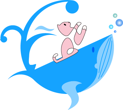
Work #6 - Whalu
This is the logo I am currently using which was created using Adobe Illustrator. I came about this design by following the tutorials, and then added the cat to make it my own. When I first saw the whale, I immediately could relate it to my life hence I would say this logo means alot to me. Whales have no limit as to where they can go and have freedom, which I wish to have. Due to some issues in the past, I sometimes feel trapped because I want to be a confident person, but I am not. The cat on the whale represents myself, because cats are lazy like I am and I also can relate to some other characteristics of a cat. The cat can be seen reaching for the tail because the tail represents the goal that it wants to reach in the future. In other words, I want to try to be the person I wish I could be. I used pink for the cat and blue for the whale because not only do they complement each other, they can also be seen as opposites culturally.
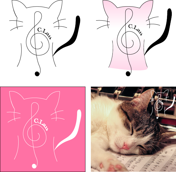
Work #7 - Cat Logo
My first logo that I created using Adobe Illustrator. My hobby is music as I like to play music instruments hence the reason why I used a treble clef as it is used in music sheets. I also combined it with the silhouette of a cat as I like cats. I did not use the whole shape of a cat because I felt that it would be too complicated therefore I tried to keep it simple by just combining the silhouette of a cat with a treble clef. I also mostly used curved lines because I want to evoke a feeling of gracefulness, joyousness and also want it to have a pleasing quality. I would use colours that are within the light pink range and make a gradient with it such as pink from the top gradually become white to the bottom as I want the colour to be pleasing to the viewer’s eye at first glance. If I were to use pink for everything, it would not look nice as it would look weird and not interesting if the head were one colour only. It is also in the cool colour range thus it represents feelings like calmness. Using cool colours also make a space seem larger. I also included my last name and initial around the outer circle of the treble clef as I wanted to make use of the space.